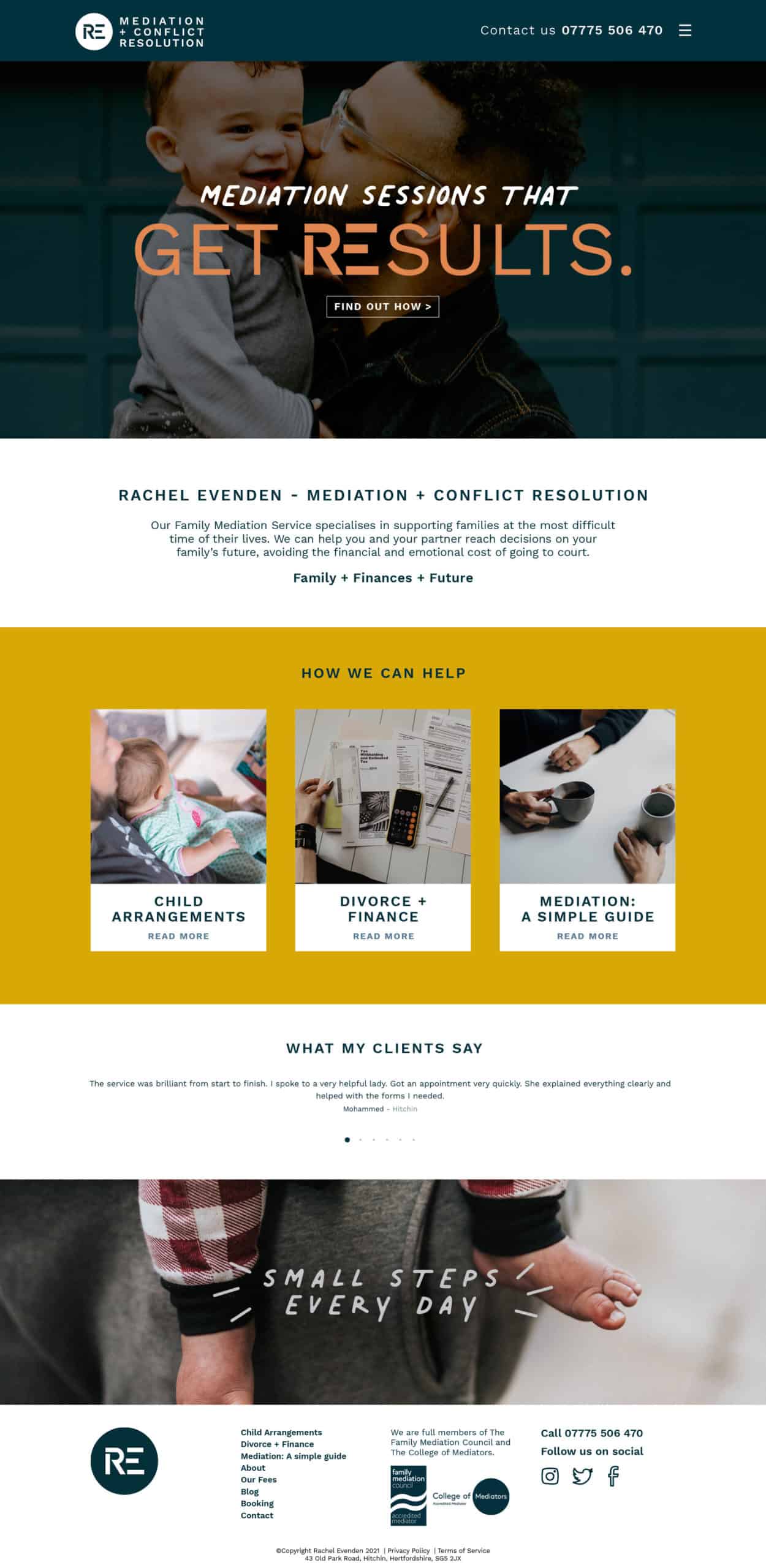
Branding for Rachel Evenden’s Mediation + Conflict Resolution Business
Rachel works with parents and families to establish successful child arrangements, financial agreements and other issues arising from relationship breakdowns.
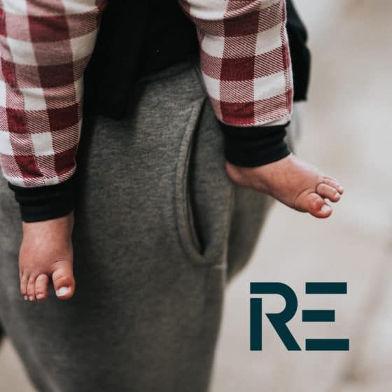
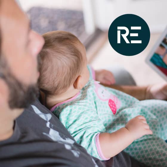
I worked with Rachel to create a branding look and feel which would appeal to her customer demographic. It was paramount that the styling of this be approachable, informal and reassuring – to put potential clients at ease and feel willing to ask for help.
Client
Rachel Evenden Mediation + Conflict Resolution
Year
2021
Services
Branding
Tone of Voice
Social Graphics
Website
Logo Family
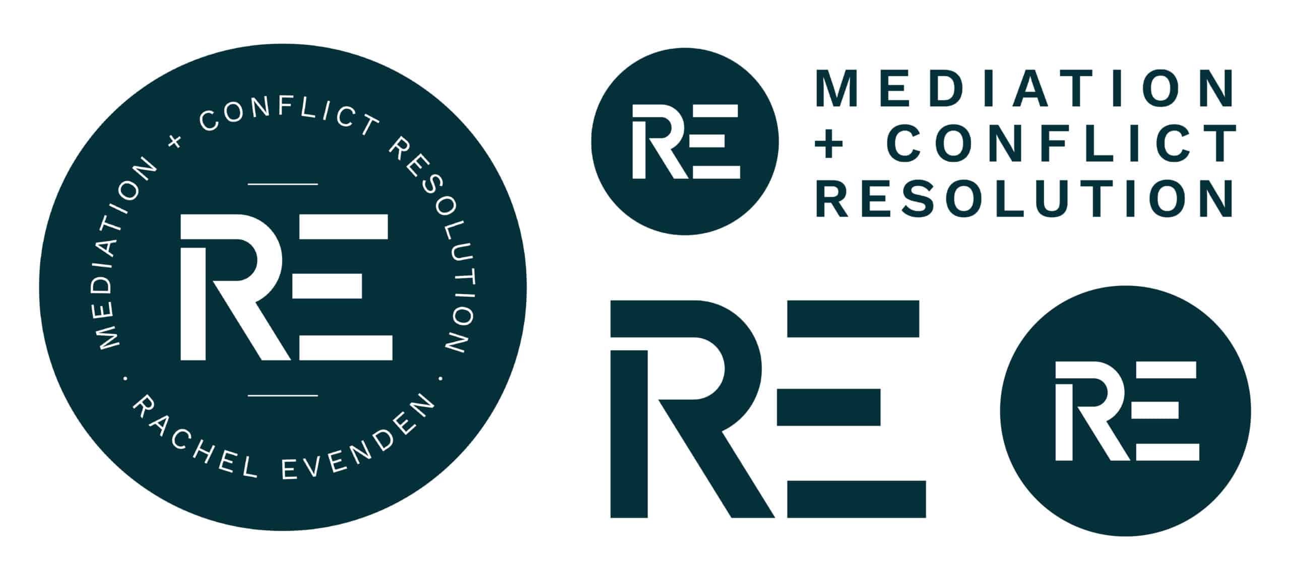
Initially I started by creating a monogram of her initials ‘RE’ – which became the focal point as I developed the suite of logos:- two roundels; one featuring her full business name, a landscape version and an icon. This family of logos gives Rachel the flexibility she needs across different sectors and mediums.
Brand styling
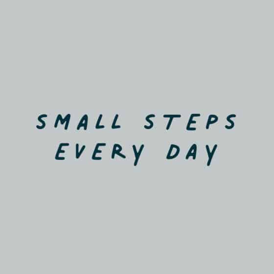
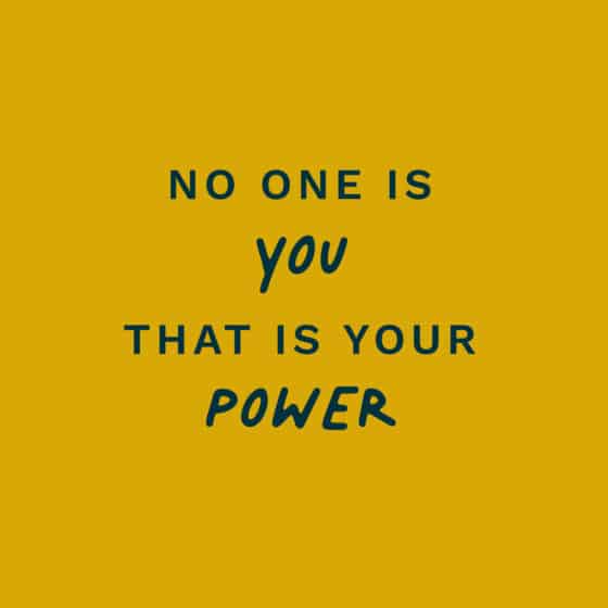
Rachel wanted her brand to talk as she would… so knowing the importance of reassurance to a potential client I worked on developing a suitable Tone of Voice. I wrote a selection of creative quotes and inspiring statements (which feature her ‘RE’ monogram too) and styled them into modern attention-grabbing graphics.


Website
We set importance on Rachel’s website being approachable and friendly with good functionality. Contact details were placed to be prominent, diverse knocked-back image styling provides a gentle feel, and a blog packed full of knowledge to rank well for SEO. WordPress site built by Dan at iam39.
What the client thinks

Working with Jackie was a complete dream. Brilliant communication, collaboration and support. She has such intuition and was able to understand the look and feel of my business through her creative and innovative ideas. The website is fresh and contemporary, appealing to the wide and diverse demographic I am trying to reach. A huge thank you Jackie. I’m thrilled with the result.


