
The influence of colour
Colour is a vital part of communicating your brand, as colour can have an instant effect of how your audience feels and reacts to your brand. In fact 62% – 90% of first impressions are based on colour alone! Our eyes are drawn to colour and it can influence our mood and actions.
Let’s take a look at how some colours can influence us…
Yellow
Depending on what shade of yellow you use, it can help your company convey positivity, hope, joy and warmth. And it can represent ‘value’.
When you think about companies with yellow in their designs, think about McDonald’s golden arches, and Subway’s fresh logo.
Green
When used in an office environment or retail space, green can be relaxing and even give off a healing vibe.
An interesting case study occurred when Heinz changed the colour of its classic ketchup from red to green, a colour known to evoke emotions relating to health. The result? One of the highest sales increase in the company’s history.
Red
If you are designing a retail space, using red can help keep customers moving in the direction you want.
Blue
A study in the Journal of Business Research, found that customers are actually 15% more likely to return to stores with blue colour schemes than to those with orange.
Black
Nike and Puma use black for an edgy vibe, while newspapers and publications use black and white for balance and simplicity.
Orange
In the same way that red increases heartbeat; orange increases oxygen and stimulates brain activity of the person gazing at the colour.
Many experts think Sainsbury’s used an orange logo to stand out on the high street and in retail parks. Why? Well, because a jaw-dropping 33% of retailers use the colour blue – and 29% use red.
Purple
It used to be one of the most expensive colours to reproduce, which is why it is sometimes associated with royalty.
The dark, rich shade of purple used by Cadbury’s is instantly linked with luxury and quality.
Colour space
A colour space is an organisation of colours. It allows for reproducible colour, in both print and digital representations.
Here are 3 colour spaces, what they mean and how they work…
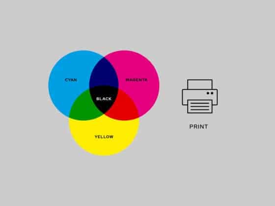
CMYK
Stands for ‘Cyan Magenta Yellow Black’ – they are the four basic colours used for printing colour images.
To make up a CMYK colour; cyan, magenta, yellow, and black ink are measured in values from 0 to 100. CMYK colours are subtractive – meaning the colours get darker as you blend them together.
Here’s some examples of the CMYK values used in basic colours;
‘Black’ would be: 0 | 0 | 0 | 100
‘Red’ would be: 0 | 100 | 100 | 0
‘Green’ would be: 100 | 0 | 100 | 0
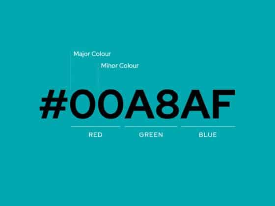
RGB & HEX
Stands for ‘Red Green Blue’ – where light is added together in various ways to reproduce a broad array of colours.
The main purpose of RGB colours is for representation of images digitally, such as on TV’s and screens.
A ‘HEX’ colour (usually used in website development) is shown as a six-digit combination of numbers and letters. These are defined by its mix of Red Green Blue. A HEX code is essentially ‘shorthand’ for its RGB values.
CMYK
Stands for ‘Cyan Magenta Yellow Black’ – they are the four basic colours used for printing colour images.
To make up a CMYK colour; cyan, magenta, yellow, and black ink are measured in values from 0 to 100. CMYK colours are subtractive – meaning the colours get darker as you blend them together.
Here’s some examples of the CMYK values used in basic colours;
‘Black’ would be: 0 | 0 | 0 | 100
‘Red’ would be: 0 | 100 | 100 | 0
‘Green’ would be: 100 | 0 | 100 | 0
RGB & HEX
Stands for ‘Red Green Blue’ – where light is added together in various ways to reproduce a broad array of colours.
The main purpose of RGB colours is for representation of images digitally, such as on TV’s and screens.
A ‘HEX’ colour (usually used in website development) is shown as a six-digit combination of numbers and letters. These are defined by its mix of Red Green Blue. A HEX code is essentially ‘shorthand’ for its RGB values.
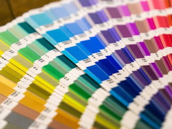
Pantone
The ‘Pantone Colour Matching System’ is a standardised colour reproduction system. Each colour is defined by a Pantone code.
By standardising colours, different manufacturers in different locations can all refer to their Pantone guide to ensure colours are a match without direct contact with one another.
In branding this is very useful to ensure that your colours (no matter where they are printed) look exactly the same across all your printed media.
Once you have your suite of Pantone colours, they can be converted into CMYK values, RGB values and HEX codes to be used across all your business touch points; printed, digital or otherwise.
Colour use in Branding
When choosing a suite of colours for your brand you will first want to consider your target audience and how colour theory might help in getting you noticed. You might choose one hero colour mixed the same hues or monochromatic colours. You can refer to a colour wheel to pick complementary colours, or perhaps pick a triadic mix of colours for high contrast.
Colour can draw your eye to an image, trigger an emotional response and even communicate something without the use of words.
See below for some examples of colour use in Branding…
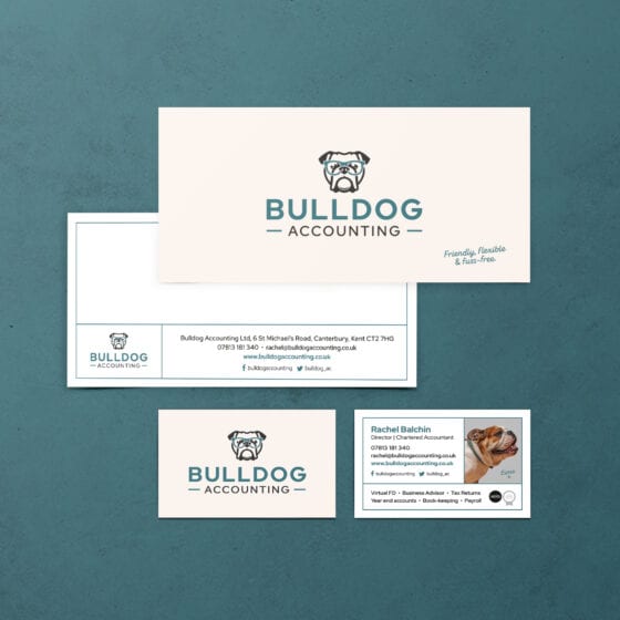
Blue as the Hero
Mixed with a cream and monochrome colour suite the Bulldog Accounting brand has a strong feel for trust and stability.

Black & White
Collusion Barbers branding predominantly uses black and white, with orange as a highlight. Giving a strong but also friendly vibe.
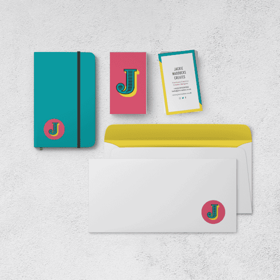
Triadic Palette
The colour palette of my own branding is high energy. Using blue, pink and yellow; these colours help to convey creativity, loyalty and fun!
Thank you for reading!
Sources: fifteendesign.co.uk • shopify.com • brandwatch.com • 99designs.co.uk • hubspot.com • wikipedia.org