Eyeworks
Evolving a fresh new look to appeal to the discerning spectacle wearer.
Brenda and her team at Eyeworks London were keen to keep their existing logo but came to me for help introducing new colours and refreshing their brand.
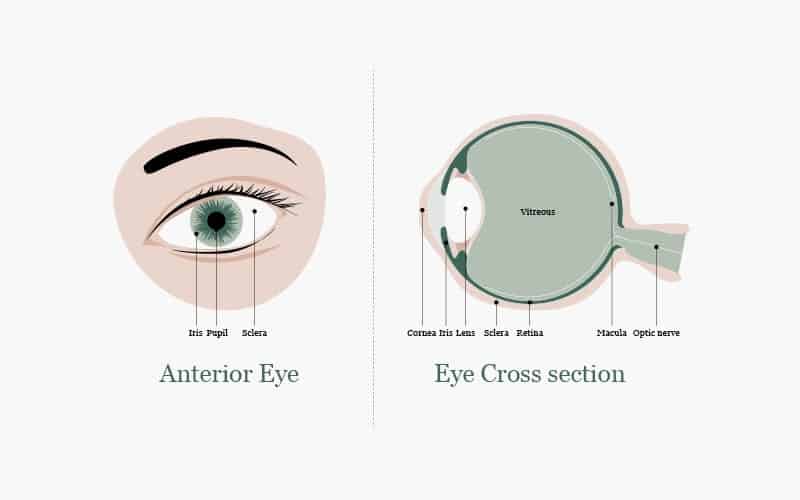
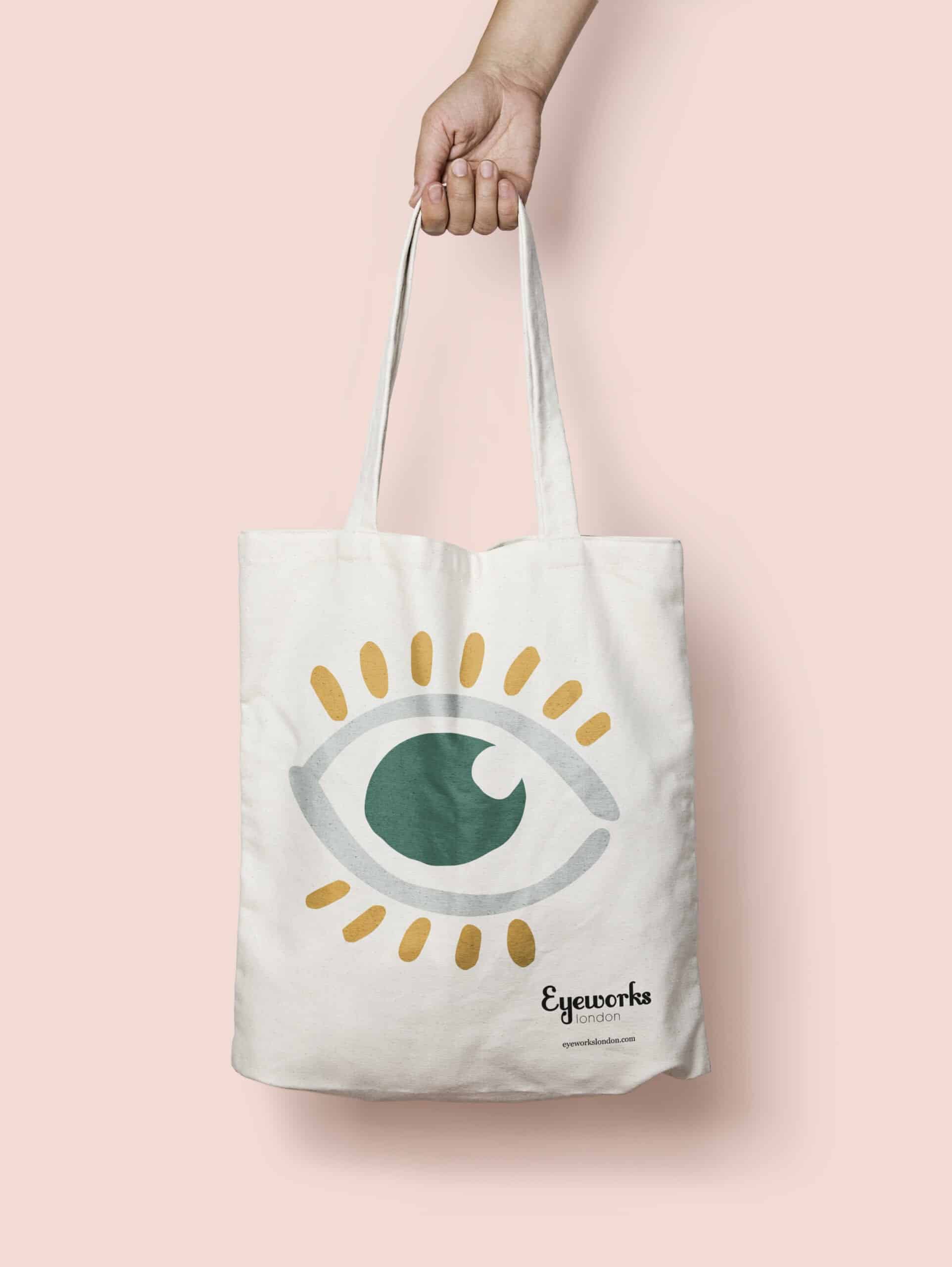
I focused on the ‘eye’ as a core visual starting point, developing the brand from there into a modern and fresh illustrative style. That style could then be adapted and manipulated for use on other design items including stationery and branded merchandise.
Client
Eyeworks London
Year
2019 – Present
Services
Branding
Creative Styling
Merchandise
Packaging
Illustrations
Abstract shapes
These hand-drawn illustrated shapes and blobs come together to make up the ‘eye’. Used separately and mixed with the colour palette we developed, these are versatile organic shapes that bring a relaxed and individual feel to this unique brand.
Branded elements
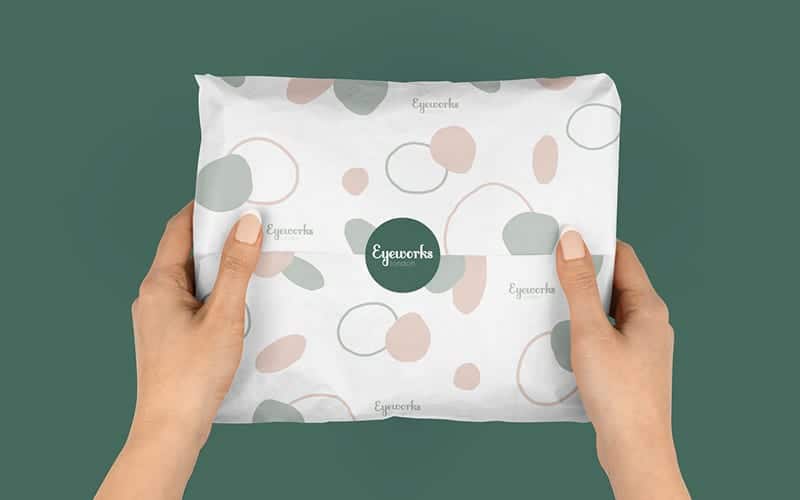
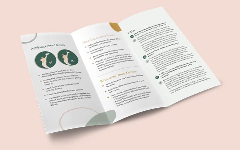
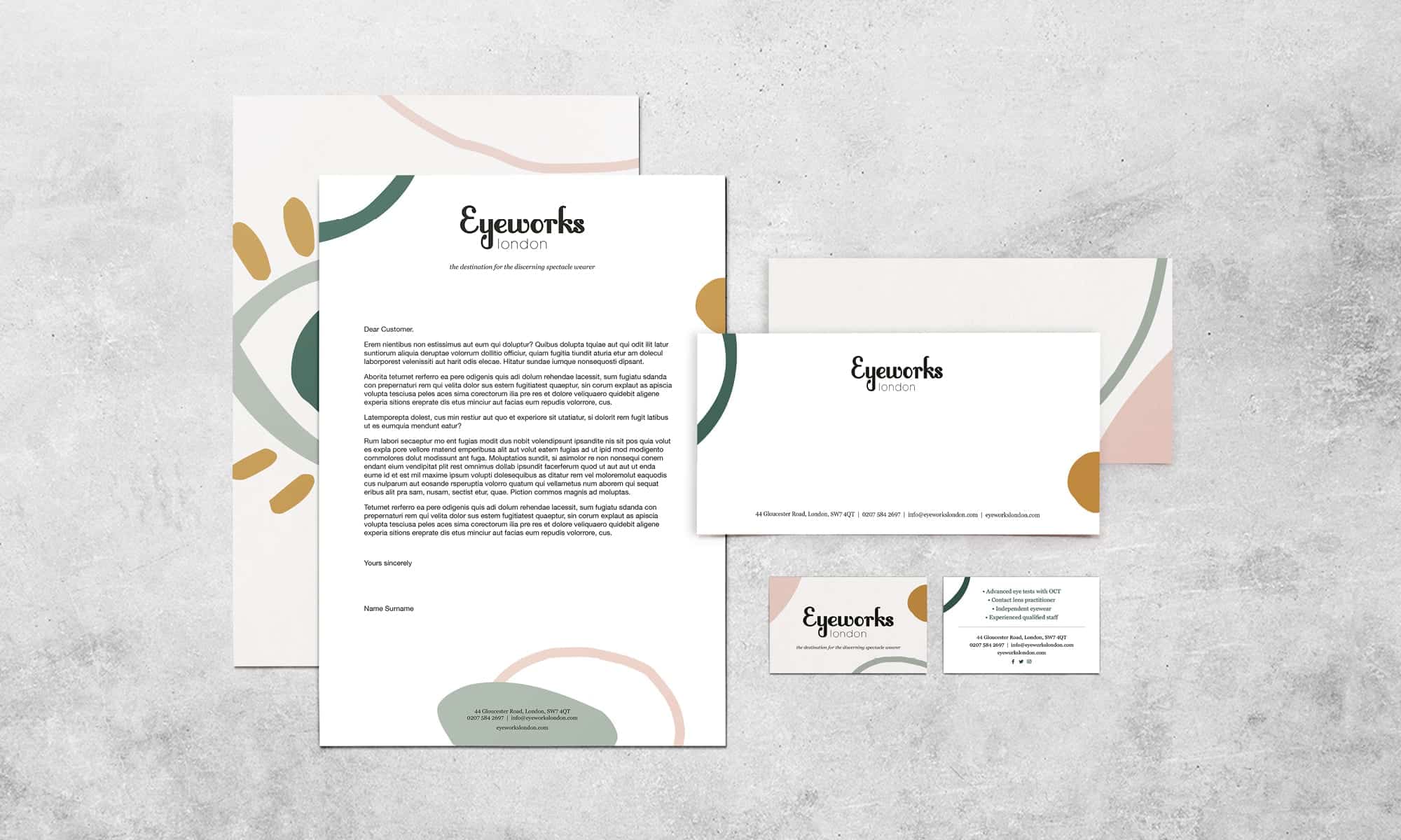
With the colour palette and abstract shapes in place, we applied the new styling in many ways, including stationery, tote bags, contact lens stickers, packaging, emails, appointment recall cards, leaflets and more.
What the client thinks

Jackie was super helpful and patient steering me through the re-branding process. Jackie really took on board my ideas while helping me explore ideas that I hadn’t considered. The result is a re-brand that I am very proud of. It is contemporary, fresh and perfectly aligns with our company personality.

