
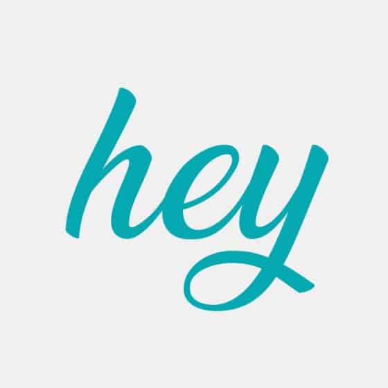
I love love love typography – as a graphic designer it’s a way of expressing feelings and value – plus the words themselves of course! It fascinates me almost everyday how using fonts to assemble the same combination of letters can not only look so different but convey different meanings too. In my creative work I carefully hand pick which typefaces will tell the story of your brand and give across the right message to your audience.
So let’s look at some typography basics – you might be wondering is it ‘Font’ or ‘Typography’? Well when metal type and printing presses where used, fonts and typefaces definitely had two different meanings. Typeface meant the design and the way the letters looked. Font referred to the particular size or style of that typeface family. Today, the terms are often used interchangeably, which is why you hear both.
If you’re interested in learning a little more about Typography I’ve set out a few sections below; illustrating the Anatomy of a typeface, details about font sizing, a little bit of history and an ‘almost’ A-Z of typographic vocabulary.
Anatomy
Here we’re going to take a look at font anatomy.
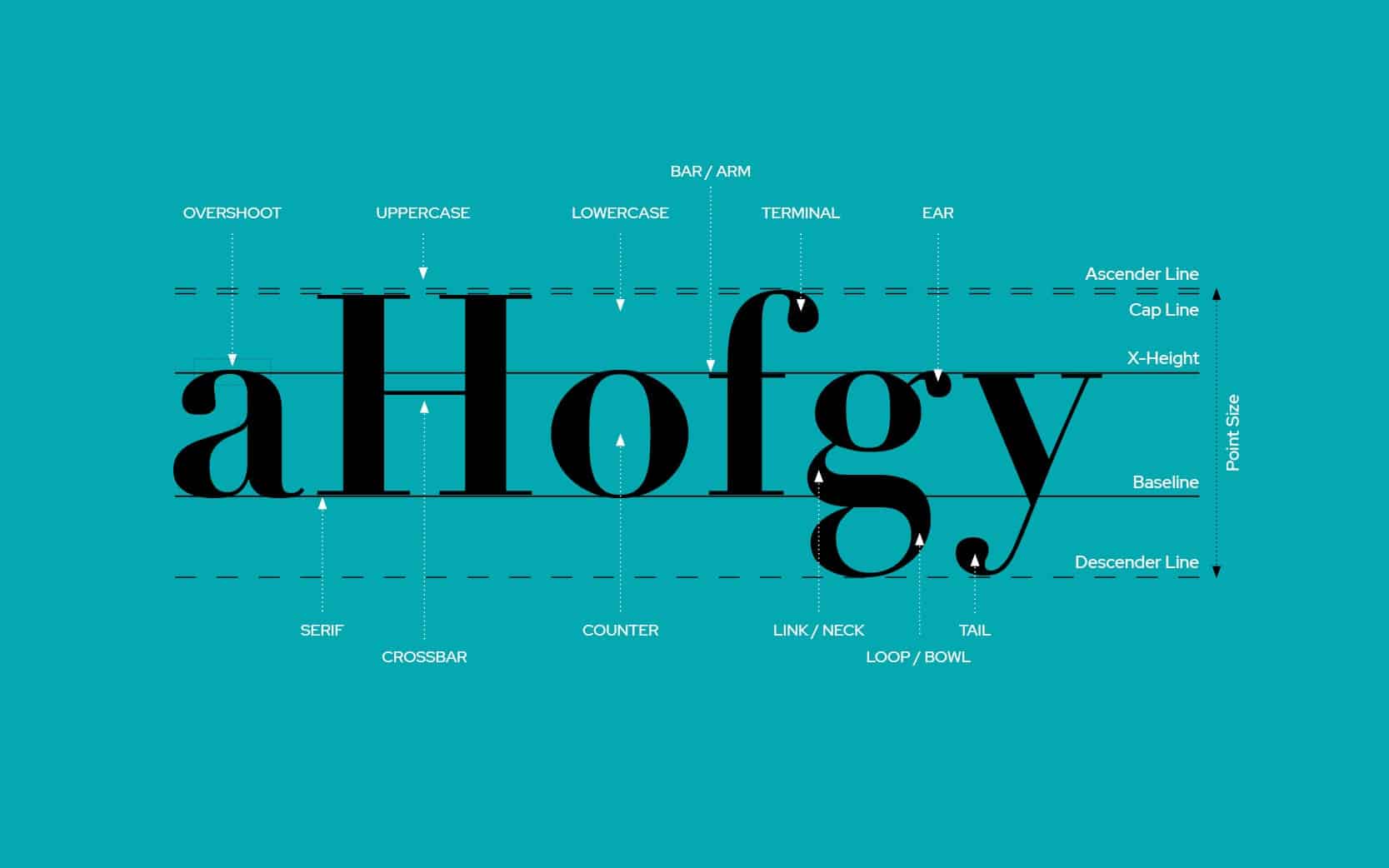
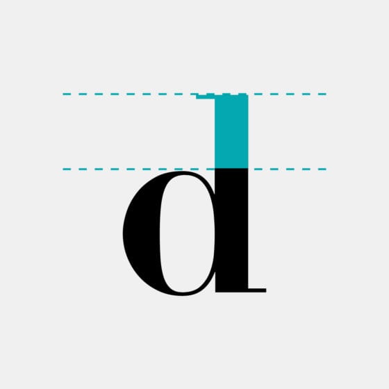
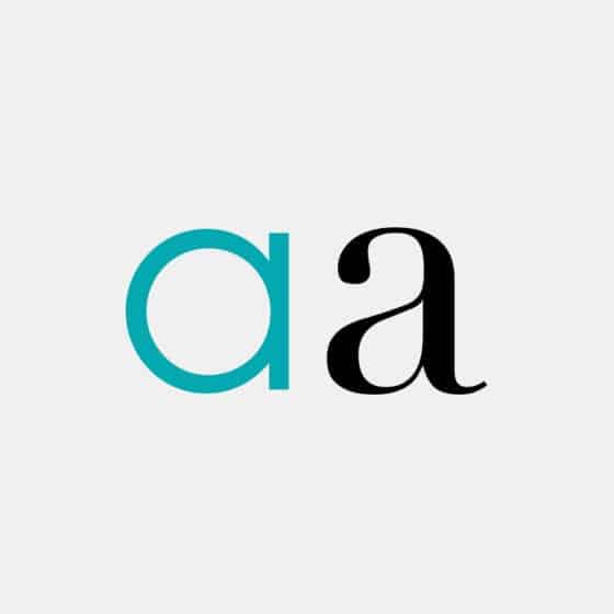
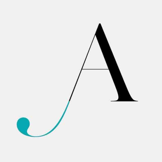
Firstly we’re looking at the Baseline, X-Height, Ascenders & Descenders (tap the image to enlarge) – which shows how each letter sits when words are written. You’ll notice the bowl of the ‘g’ hangs down past the baseline and the ascender of the ‘f’ reaches up above the x-height. The overshoot on the ‘a’ occurs when a rounded or poised letter extends past the x-height slightly and this is to create the visual effect that all the letters are the same height when in fact they are not. Magic!
The letters themselves can be broken down further still into different parts, a bit like a puzzle. These parts give fonts their mood, style and features and also how readable they are. You can take a look at some of these later in the Blog under ‘Typography Vocabulary’.
Point Size
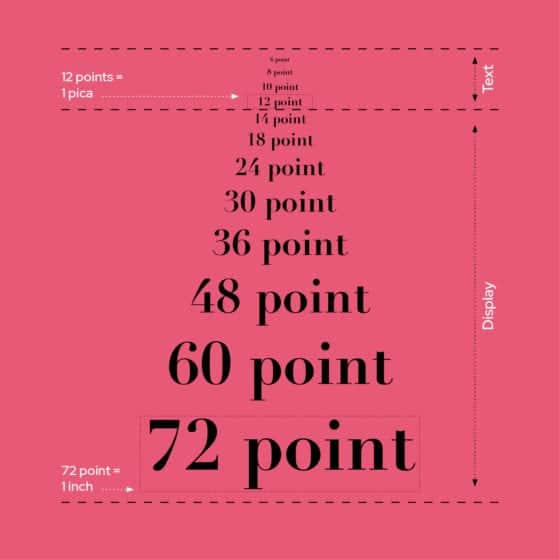
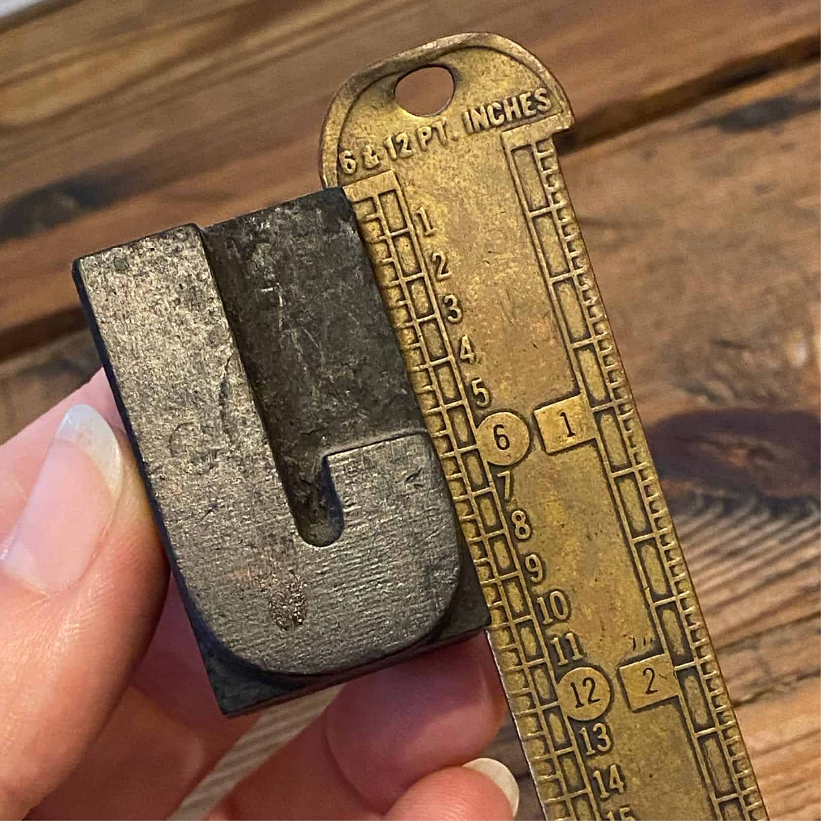
When the metal type system was invented sizes needed to be invented too and the terms ‘pica’ and ‘points’ were born. Pica is a scale which refers to 12 points. This scale was used to measure the metal printing blocks and ensure the right size was set up for printing on the presses. { Fig/1 }
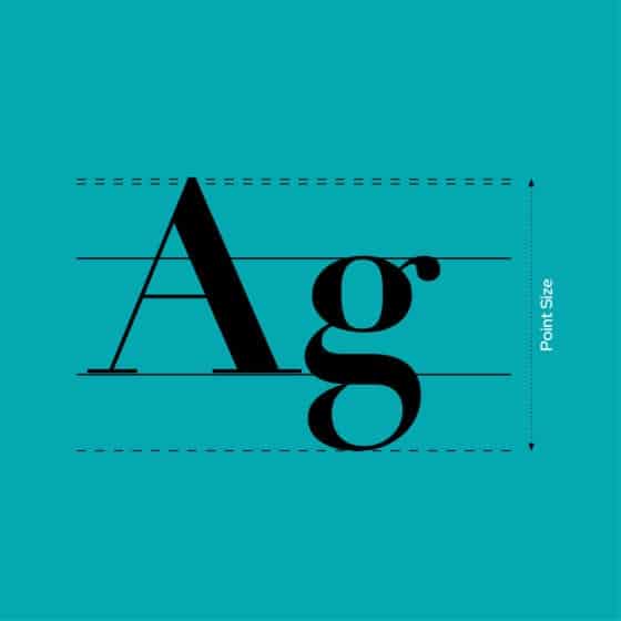
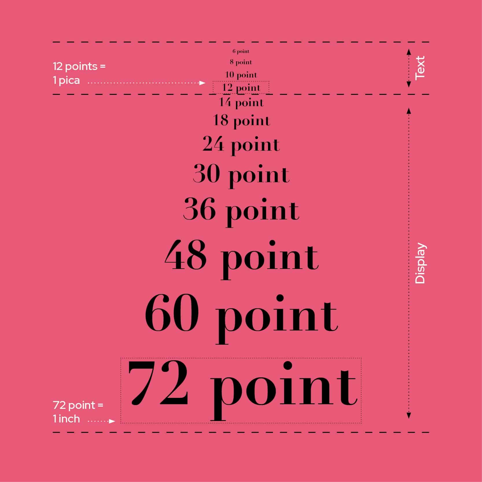
Now, we use computers to set our text, with the ‘point’ measurement surviving the test of time. When setting a font to 12pt our programs calculate the entire font height for us { Fig/2 } and scale it accordingly when we want to change the size. Clever hey!
With billions of fonts available it’s baffling that the sizes sometimes don’t match. 12pt in Ariel for example may be bigger than a 12pt using Times. Crazy I know! But as a general rule for copywriting you’d want to use somewhere between 8pt and 12pt with ‘12’ seen to be best for optimum legibility. Take a look at { Fig/3 } for a visual guide on point sizes.

A little history…
Let’s take a look back in time…. in the 1400’s Guttenberg invented movable typefaces, which gave the world a cheaper way of obtaining the written word. Before this time everything had to be done over and over again by hand, which was of course very costly. By the 1700’s many type designers emerged creating their own typefaces which are still used today, big names such as Caslon, Baskerville, Didot and Bodoni. And in 1957 probably the most loved typeface of our time ‘Helvetica’ was invented by a Swiss designer Max Miedinger. Skip to today and we are totally spoilt for choice – an abundance of typefaces are available to us from internet libraries. Adobe and Google are some of the latest on the block – offering web safe font families too.
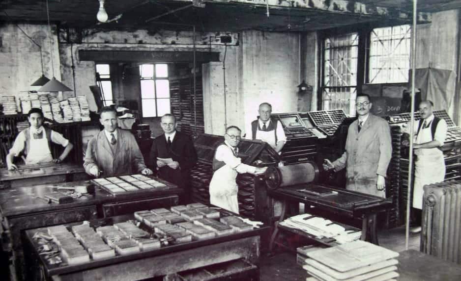
And the photograph here is of my Grandad. When he was 18 years old learning how to set up the font blocks for newspaper printing at The Mirror. He’s at the far back on the left. I feel very lucky to have been given a beautiful heirloom from my Grandad’s typesetting days; a ‘vintage brass pica’ – also known as a typesetting ruler (see it above in Fig/1).
Typography Vocabulary
As a graphic designer I’m more than sure that from time to time I use words and nerdy designery vocabulary which may not be understood. So as part of this blog I thought it might be fun to provide you with some illustrated explanations of typography terms.
Not quite a full A-Z of terms but enough to get your teeth into…
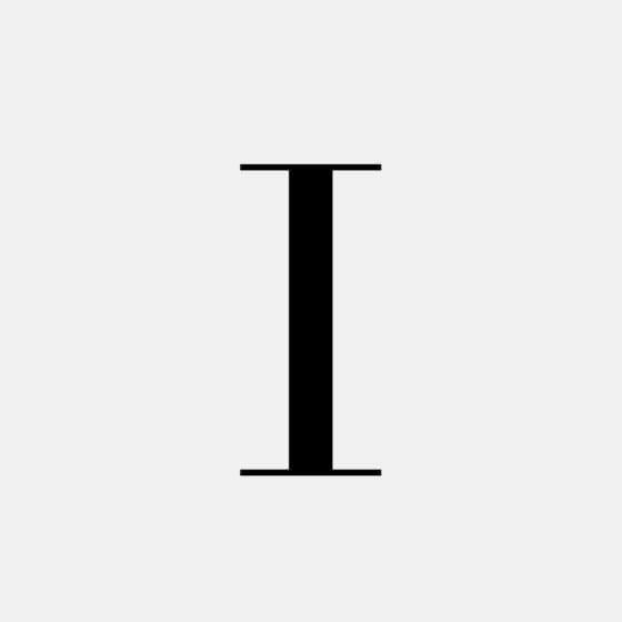
Acender
On lowercase letters the vertical stroke that extends above the x-height.
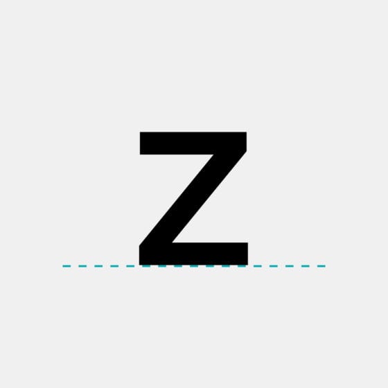
Baseline
Invisible line on which the letters in a font rest.
Cursive
Handwriting with joined-up letters. Can be used to describe an italic font which is similar to handwriting.
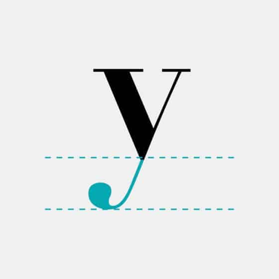
Descender
Parts of lowercase letters that extend below the baseline.
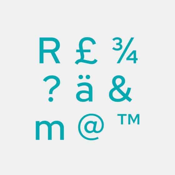
Glyph
A single character (number, letter, mark or symbol) is represented by a glyph.
Italic
Slanted to the right unlike roman typefaces which are upright.
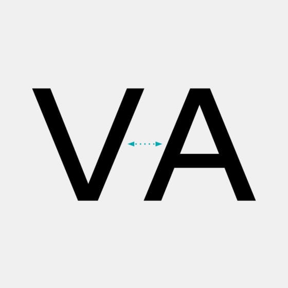
Kerning
Adjustments to the space between pairs of letters, used to correct spacing problems in combinations like ‘VA’.
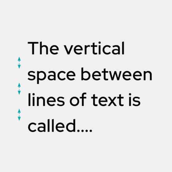
Leading
Vertical space between lines of text, from baseline to baseline.
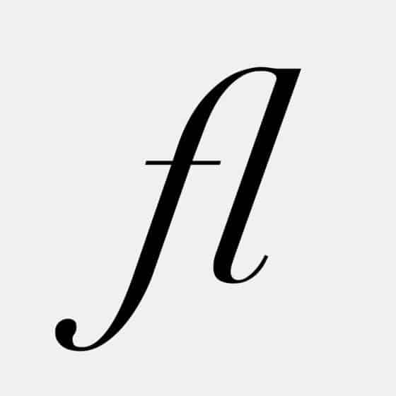
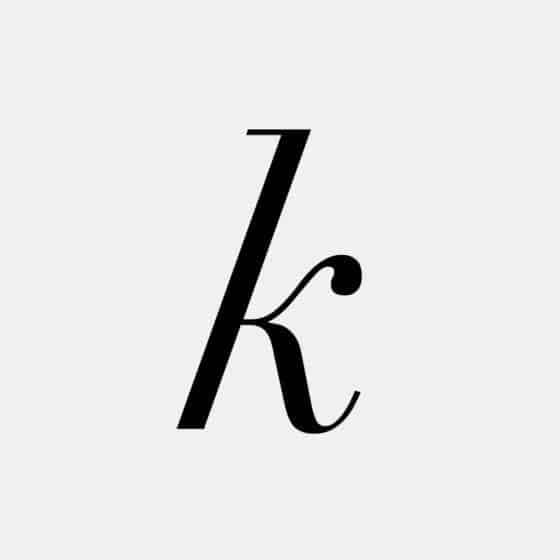
Ligature
Two or more letters joined together to form one glyph.
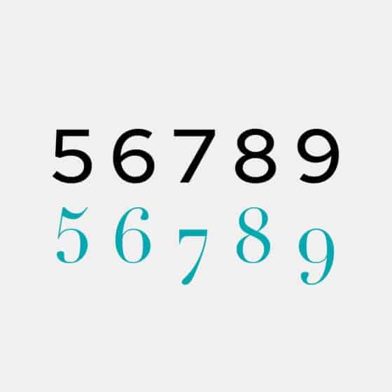
Old style
Numbers aligned with the lowercase, traditionally used for body text setting.
Serif
Small stroke at the beginning or end of main strokes of a letter.
Single-tier
When an ‘a’ or ‘g’ has one counter rather than two.
Swash
Exaggerated decorative serif, terminal or tail.

Weight
The heaviness of a typeface, independent of its size; can refer to a style within a font family (Thin or Regular).
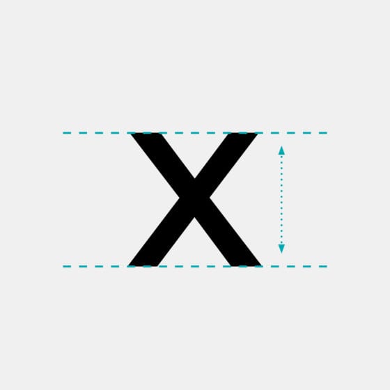
X-height
Height of the lowercase ‘x’ which is used as a guideline for the height of unextended lowercase letters.
“The quick brown fox jumps over the lazy dog“
Do you know it? Well if you’re wondering this is an English-language pangram — a sentence that contains all of the letters of the English alphabet. This phrase is well known among designers and is commonly used to display examples of fonts. It’s really useful to visually see all the letters in the alphabet assembled together in a sentence to get a feel for the style of the typeface.
I hope this read has been interesting and has taught you a thing or two about the vast subject of typography! While writing this I have realised there is so much more I could share with you. I will need to write another blog! We’ve not even covered font styles, day to day usage, how to purchase font licences, font pairing. I could go on and on… so watch out for another Typography blog next year.
Thank you for reading!
Illustrations: Drawn by Jackie Maddocks, JM Creates.
Sources: Fontsmith • Ashworth Creative • Canva • Visme • Online Printers • Creative Market
Books: Magma (Lawrence King Publishing Ltd), Glyph* by Anna Davies (Cicada Books Limited), The Geometry of Type by Stephen Coles (Thames & Hudson), Type & Typography by Phil Baines & Andrew Haslam (Lawrence King Publishing Ltd).