Design

hitchin together we stand against racism logo branding

Together we stand against racism

Together we stand against racism 2560 2560 Jackie Maddocks Creates

Together we stand against racism event unites Hitchin community…

In response to the racist abuse experienced by England footballers after the Euros, Tony Williams, Chairperson for North Herts Diversity + Culture Group along with North Herts African Caribbean Community organised this anti-racism event, which took place on Windmill Hill Hitchin on 1 August 2021.

Speakers included
• Tony Williams, Chairperson of North Herts Diversity + Culture Group
• Garage MC Quinton Green, Founder and CEO of Knife Crime Victim Support
• ‘Heroine of Hackney’ Pauline Pearce
• Wayne Haynes, a Survivor of the New Cross Fire in 1981


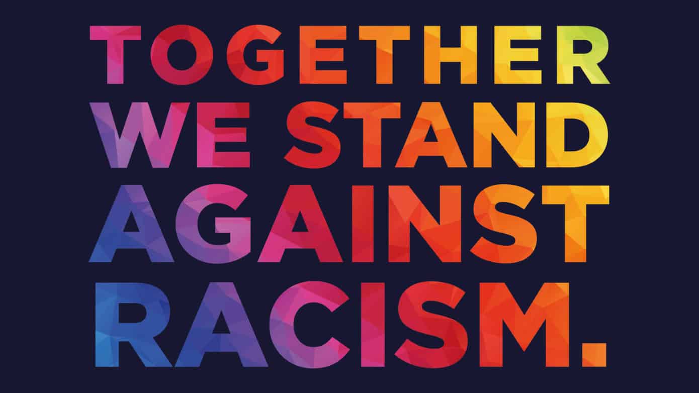
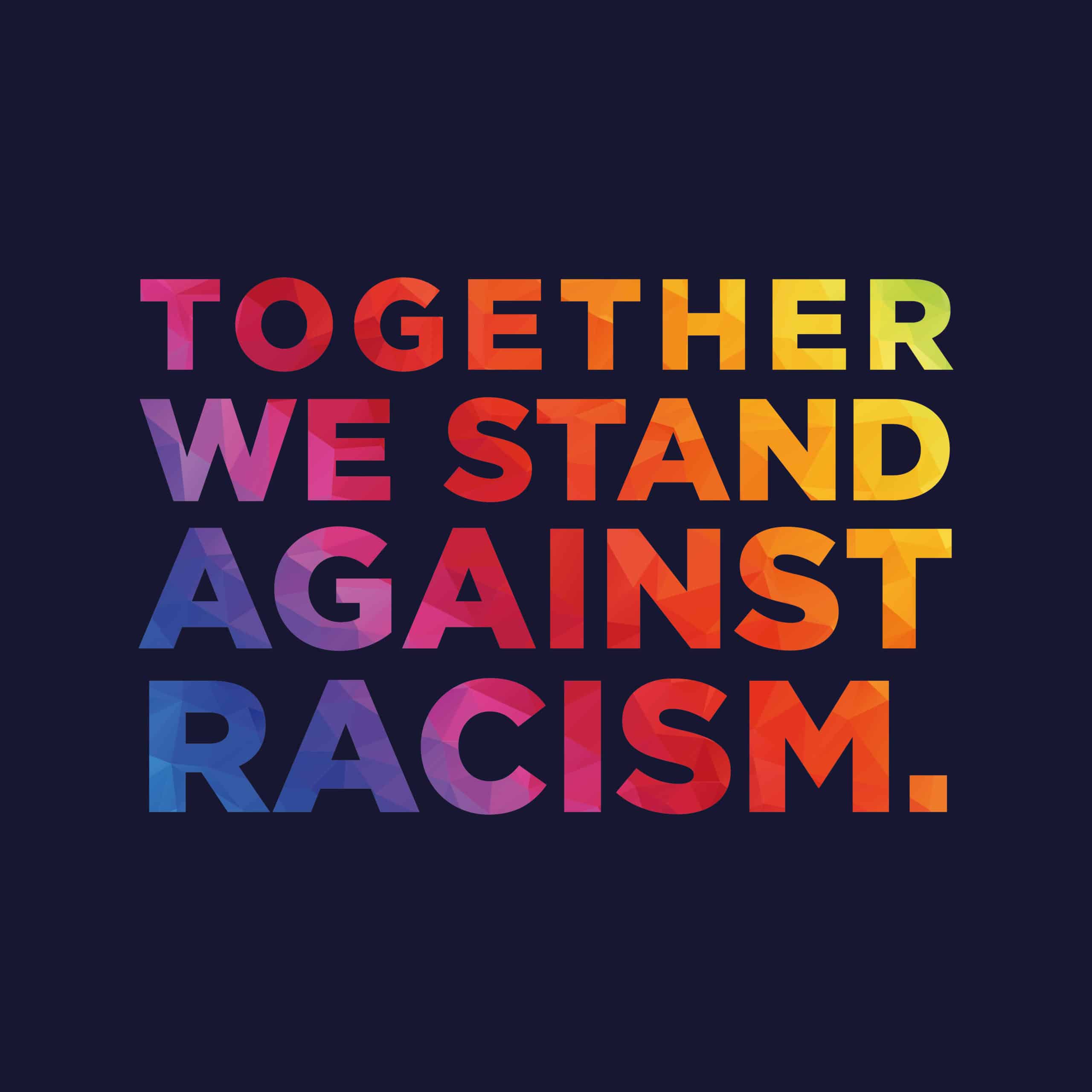
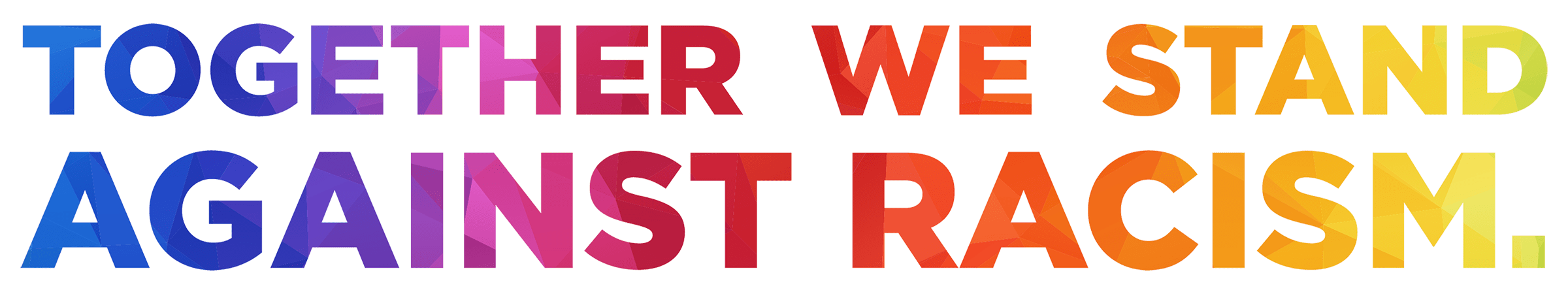
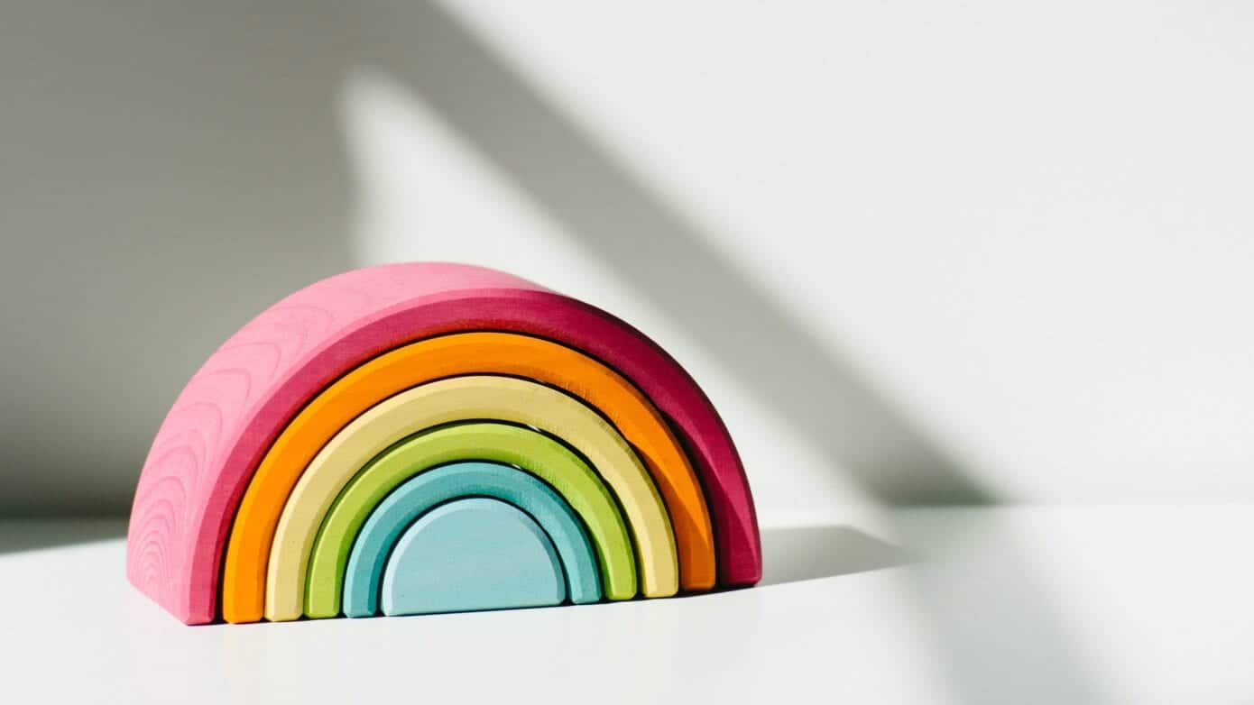
My creative contribution to this event was the graphical rainbow lettering designed to be eye-catching and inclusive. We used this on banners, advertising, social media + t-shirts.

hitchin together we stand against racism logo branding

Photos from the day…

together we stand against racism organisers speakers spoken word
together we stand hitchin windmill hill event
black lives matter banner event hitchin
anti racism together we stand event hitchin
jackie maddocks dash creative designer anti racism event
tony williams jackie maddocks hitchin graphic designer t-shirts
anti racism together we stand event windmill hill
taking the knee black lives matter hitchin

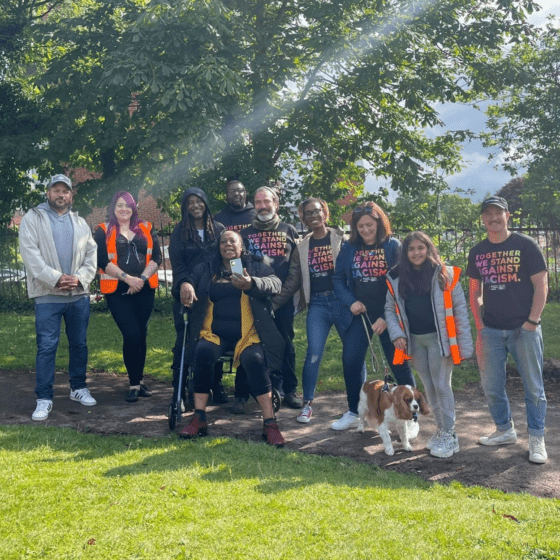
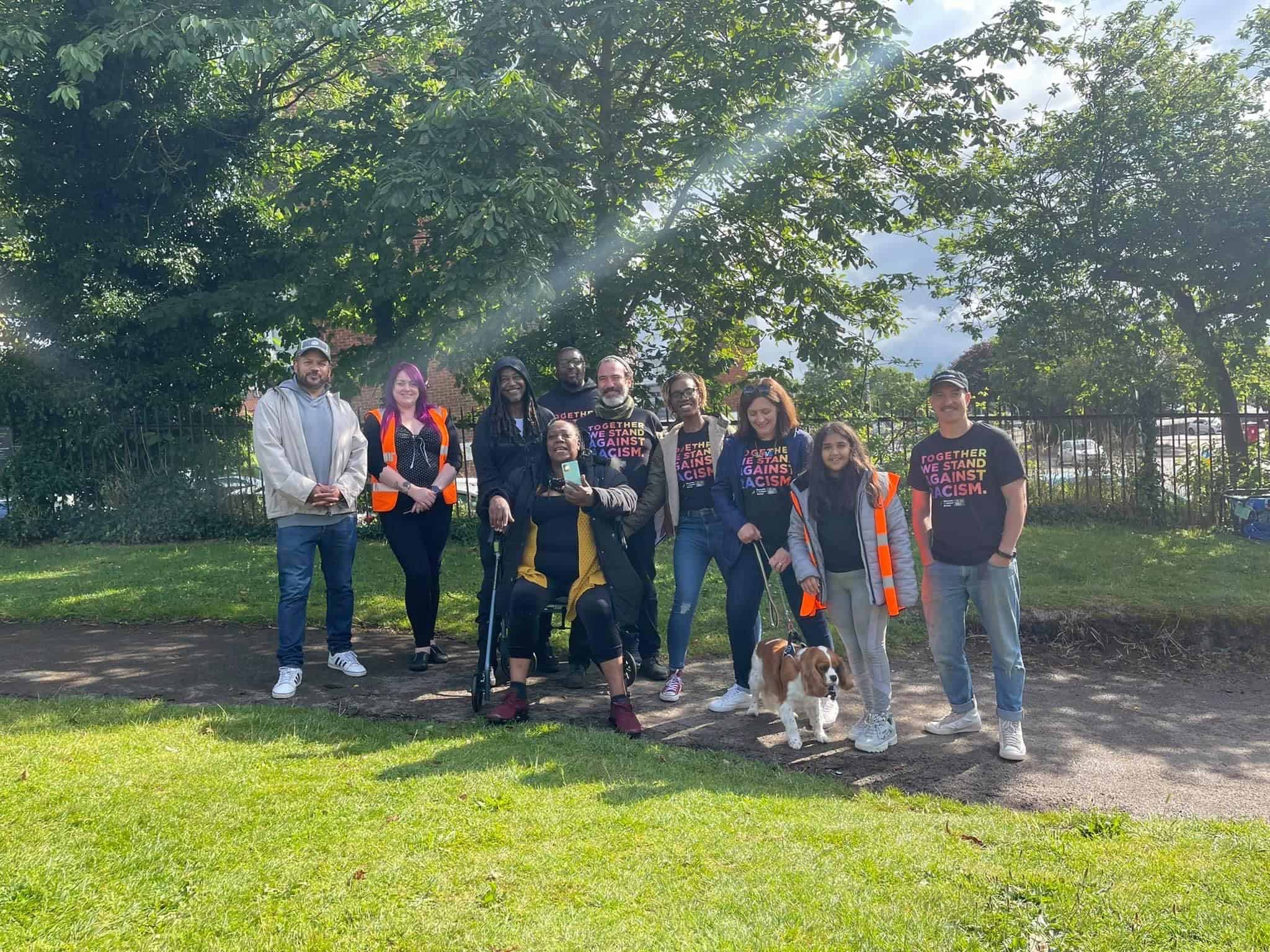
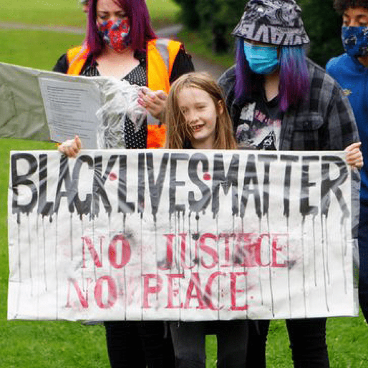
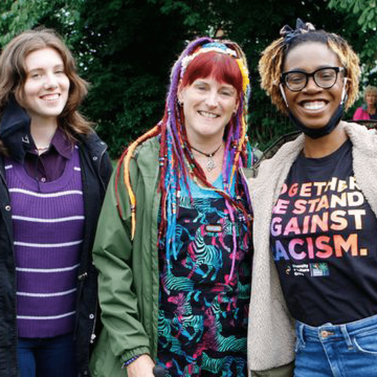
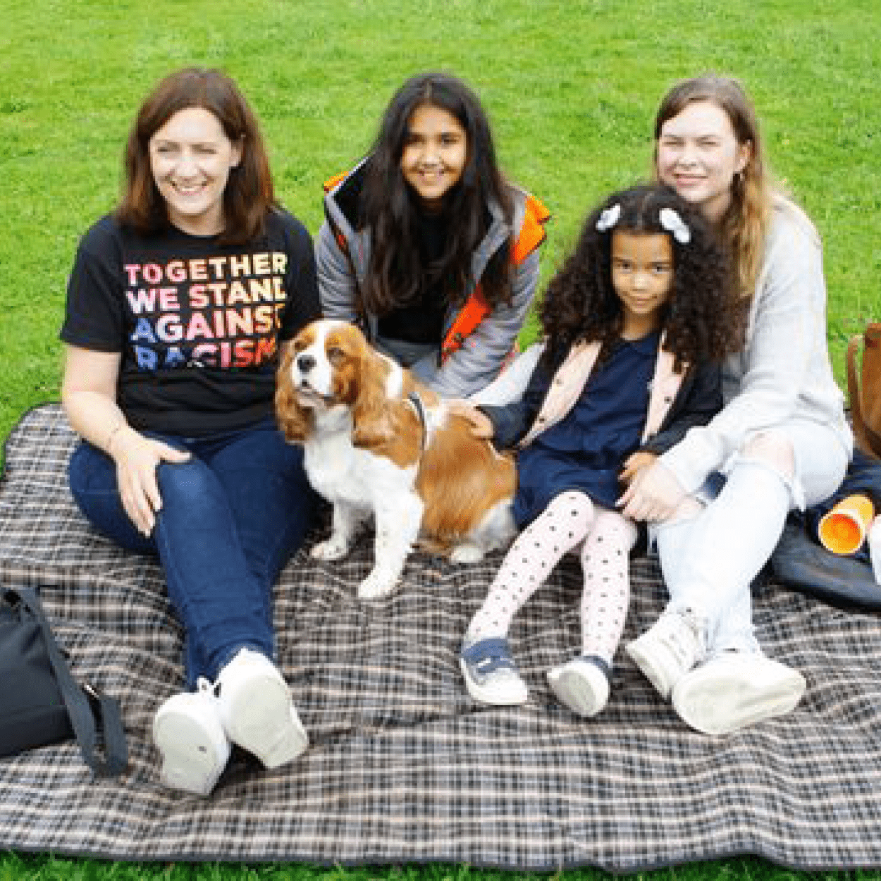
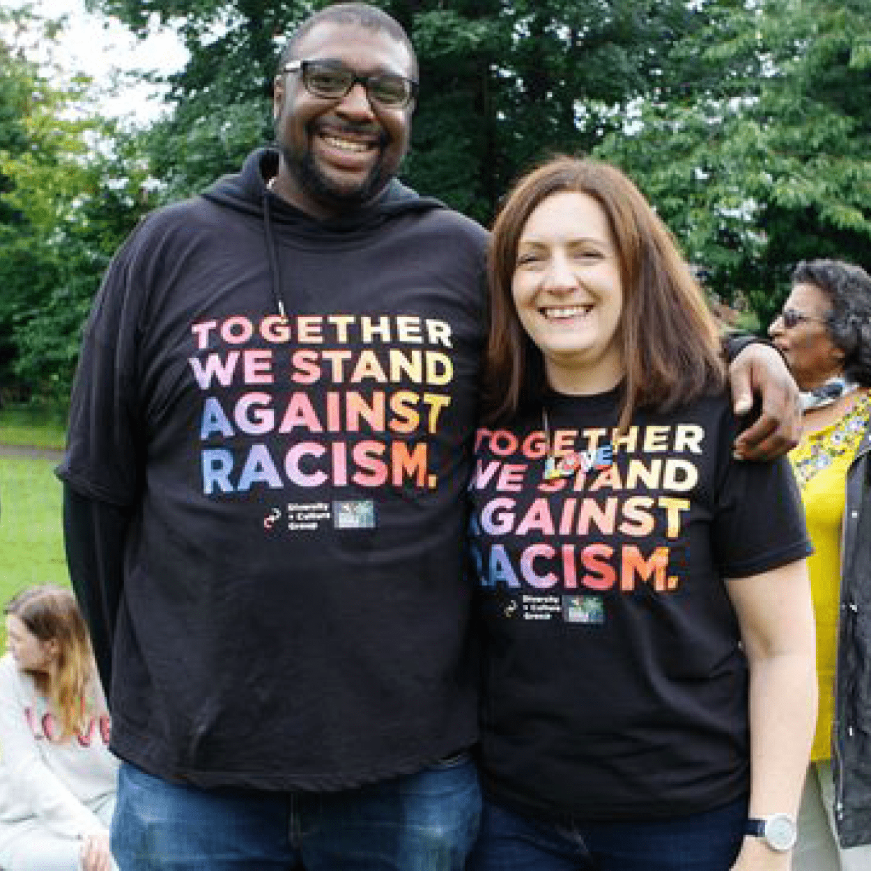
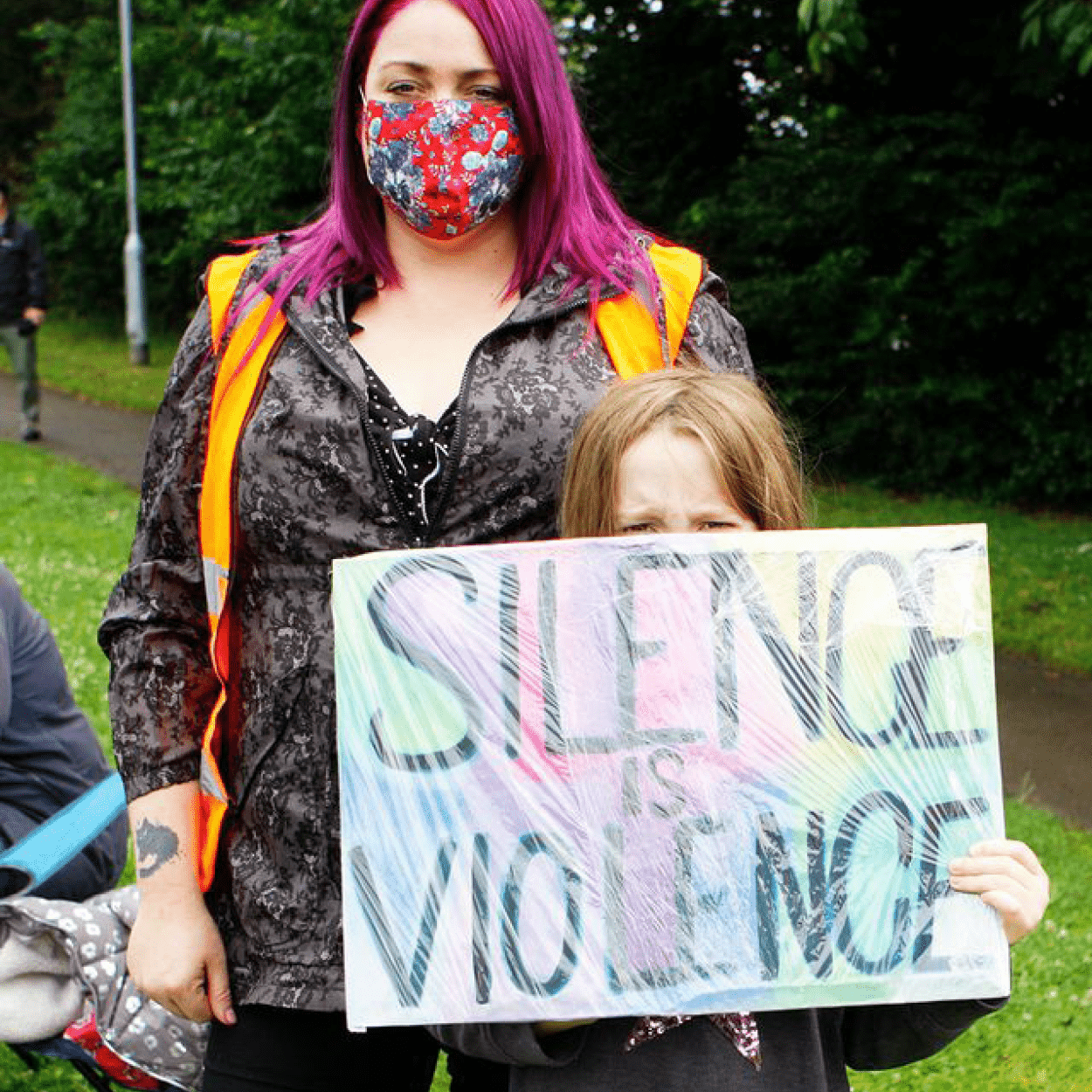
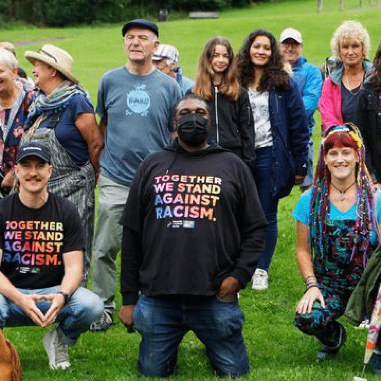
Photography: Karyn Haddon

together we stand against racism text rainbow diversity

Read more articles here: The Comet, Hertfordshire Mercury

*Designed elements: by Jackie Maddocks, JM Creates.

On the blog

Typography basics blog font type lettering

The Basics of Typography

The Basics of Typography 2560 1709 Jackie Maddocks Creates

I love love love typography – as a graphic designer it’s a way of expressing feelings and value – plus the words themselves of course! It fascinates me almost everyday how using fonts to assemble the same combination of letters can not only look so different but convey different meanings too. In my creative work I carefully hand pick which typefaces will tell the story of your brand and give across the right message to your audience.

So let’s look at some typography basics – you might be wondering is it ‘Font’ or ‘Typography’? Well when metal type and printing presses where used, fonts and typefaces definitely had two different meanings. Typeface meant the design and the way the letters looked. Font referred to the particular size or style of that typeface family. Today, the terms are often used interchangeably, which is why you hear both. 

If you’re interested in learning a little more about Typography I’ve set out a few sections below; illustrating the Anatomy of a typeface, details about font sizing, a little bit of history and an ‘almost’ A-Z of typographic vocabulary.

Anatomy

Here we’re going to take a look at font anatomy.

Firstly we’re looking at the Baseline, X-Height, Ascenders & Descenders (tap the image to enlarge) – which shows how each letter sits when words are written. You’ll notice the bowl of the ‘g’ hangs down past the baseline and the ascender of the ‘f’ reaches up above the x-height. The overshoot on the ‘a’ occurs when a rounded or poised letter extends past the x-height slightly and this is to create the visual effect that all the letters are the same height when in fact they are not. Magic!

The letters themselves can be broken down further still into different parts, a bit like a puzzle. These parts give fonts their mood, style and features and also how readable they are. You can take a look at some of these later in the Blog under ‘Typography Vocabulary’.

Point Size

When the metal type system was invented sizes needed to be invented too and the terms ‘pica’ and ‘points’ were born. Pica is a scale which refers to 12 points. This scale was used to measure the metal printing blocks and ensure the right size was set up for printing on the presses. { Fig/1 }

Now, we use computers to set our text, with the ‘point’ measurement surviving the test of time. When setting a font to 12pt our programs calculate the entire font height for us { Fig/2 } and scale it accordingly when we want to change the size. Clever hey!

With billions of fonts available it’s baffling that the sizes sometimes don’t match. 12pt in Ariel for example may be bigger than a 12pt using Times. Crazy I know! But as a general rule for copywriting you’d want to use somewhere between 8pt and 12pt with ‘12’ seen to be best for optimum legibility. Take a look at { Fig/3 } for a visual guide on point sizes.

A little history…

Let’s take a look back in time…. in the 1400’s Guttenberg invented movable typefaces, which gave the world a cheaper way of obtaining the written word. Before this time everything had to be done over and over again by hand, which was of course very costly. By the 1700’s many type designers emerged creating their own typefaces which are still used today, big names such as Caslon, Baskerville, Didot and Bodoni. And in 1957 probably the most loved typeface of our time ‘Helvetica’ was invented by a Swiss designer Max Miedinger. Skip to today and we are totally spoilt for choice – an abundance of typefaces are available to us from internet libraries. Adobe and Google are some of the latest on the block – offering web safe font families too.

And the photograph here is of my Grandad. When he was 18 years old learning how to set up the font blocks for newspaper printing at The Mirror. He’s at the far back on the left. I feel very lucky to have been given a beautiful heirloom from my Grandad’s typesetting days; a ‘vintage brass pica’ – also known as a typesetting ruler (see it above in Fig/1).

Typography Vocabulary

As a graphic designer I’m more than sure that from time to time I use words and nerdy designery vocabulary which may not be understood. So as part of this blog I thought it might be fun to provide you with some illustrated explanations of typography terms.

Not quite a full A-Z of terms but enough to get your teeth into…

ACESNDER
Acender

On lowercase letters the vertical stroke that extends above the x-height.

BASELINE
Baseline

Invisible line on which the letters in a font rest.

CURSIVE
Cursive

Handwriting with joined-up letters. Can be used to describe an italic font which is similar to handwriting.

DECENDER
Descender

Parts of lowercase letters that extend below the baseline.

GLYPH
Glyph

A single character (number, letter, mark or symbol) is represented by a glyph.

ITALIC
Italic

Slanted to the right unlike roman typefaces which are upright.

KERNING
Kerning

Adjustments to the space between pairs of letters, used to correct spacing problems in combinations like ‘VA’.

LEADING
Leading

Vertical space between lines of text, from baseline to baseline.

LIGATURE
Ligature

Two or more letters joined together to form one glyph.

OLD STYLE
Old style

Numbers aligned with the lowercase, traditionally used for body text setting.

SERIF
Serif

Small stroke at the beginning or end of main strokes of a letter.

SINGLE-TIER
Single-tier

When an ‘a’ or ‘g’ has one counter rather than two.

SWASH
Swash

Exaggerated decorative serif, terminal or tail.

WEIGHT
Weight

The heaviness of a typeface, independent of its size; can refer to a style within a font family (Thin or Regular).

X-HEIGHT
X-height

Height of the lowercase ‘x’ which is used as a guideline for the height of unextended lowercase letters.


The quick brown fox jumps over the lazy dog

Do you know it? Well if you’re wondering this is an English-language pangram — a sentence that contains all of the letters of the English alphabet. This phrase is well known among designers and is commonly used to display examples of fonts. It’s really useful to visually see all the letters in the alphabet assembled together in a sentence to get a feel for the style of the typeface.

I hope this read has been interesting and has taught you a thing or two about the vast subject of typography! While writing this I have realised there is so much more I could share with you. I will need to write another blog! We’ve not even covered font styles, day to day usage, how to purchase font licences, font pairing. I could go on and on… so watch out for another Typography blog next year.

Thank you for reading!

Illustrations: Drawn by Jackie Maddocks, JM Creates.
Sources:
Fontsmith • Ashworth CreativeCanvaVismeOnline PrintersCreative Market
Books:
Magma (Lawrence King Publishing Ltd), Glyph* by Anna Davies (Cicada Books Limited), The Geometry of Type by Stephen Coles (Thames & Hudson), Type & Typography by Phil Baines & Andrew Haslam (Lawrence King Publishing Ltd).

On the blog

jm creates rainbow creative graphic designer

Colour Works

Colour Works 2560 1316 Jackie Maddocks Creates

The influence of colour

Colour is a vital part of communicating your brand, as colour can have an instant effect of how your audience feels and reacts to your brand. In fact 62% – 90% of first impressions are based on colour alone! Our eyes are drawn to colour and it can influence our mood and actions.

Let’s take a look at how some colours can influence us…

Yellow

Yellow is an energetic colour that represents fun, happiness, and sunshine.

Depending on what shade of yellow you use, it can help your company convey positivity, hope, joy and warmth. And it can represent ‘value’.

When you think about companies with yellow in their designs, think about McDonald’s golden arches, and Subway’s fresh logo.

Green

Depending greatly on the shade of green, it can represent Earth, nature, growth or money. It conveys freshness, calm and is environmentally friendly.

When used in an office environment or retail space, green can be relaxing and even give off a healing vibe.

An interesting case study occurred when Heinz changed the colour of its classic ketchup from red to green, a colour known to evoke emotions relating to health. The result? One of the highest sales increase in the company’s history.

Red

According to a study published in the journal ‘Emotion’, found that people react faster and more forcefully to red, the primary reason behind the phenomena being that the colour red enhances physical reactions. Retailers use red to grab customer’s attention and cue them to take action in making a purchase.

If you are designing a retail space, using red can help keep customers moving in the direction you want.

Blue

The most popular colour in logos and in the corporate world is blue. The reason why is because blue is a very calming, but it also has many positive qualities including loyalty, strength, wisdom and trust.

A study in the Journal of Business Research, found that customers are actually 15% more likely to return to stores with blue colour schemes than to those with orange.

Black

Black is professional and credible. White is clean and pure, using them together makes for a logo that is timeless and beautiful.

Nike and Puma use black for an edgy vibe, while newspapers and publications use black and white for balance and simplicity.

Orange

A marketing experiment which attributed three words to each colour used by prominent companies, orange attracted connotations of ‘friendly, confidence and cheerful’.

In the same way that red increases heartbeat; orange increases oxygen and stimulates brain activity of the person gazing at the colour.

Many experts think Sainsbury’s used an orange logo to stand out on the high street and in retail parks. Why? Well, because a jaw-dropping 33% of retailers use the colour blue – and 29% use red.

Purple

Often associated with luxury, power, wisdom, creativity, and magic, it is the balancing colour between red and blue’s colour psychologies.

It used to be one of the most expensive colours to reproduce, which is why it is sometimes associated with royalty.

The dark, rich shade of purple used by Cadbury’s is instantly linked with luxury and quality.

Colour space

A colour space is an organisation of colours. It allows for reproducible colour, in both print and digital representations.

Here are 3 colour spaces, what they mean and how they work…

CMYK

Stands for ‘Cyan Magenta Yellow Black’ – they are the four basic colours used for printing colour images.

To make up a CMYK colour; cyan, magenta, yellow, and black ink are measured in values from 0 to 100. CMYK colours are subtractive – meaning the colours get darker as you blend them together.

Here’s some examples of the CMYK values used in basic colours;
‘Black’ would be: 0 | 0 | 0 | 100
‘Red’ would be: 0 | 100 | 100 | 0
‘Green’ would be: 100 | 0 | 100 | 0

hex colour breakdown

RGB & HEX

Stands for ‘Red Green Blue’ – where light is added together in various ways to reproduce a broad array of colours.

The main purpose of RGB colours is for representation of images digitally, such as on TV’s and screens.

A ‘HEX’ colour (usually used in website development) is shown as a six-digit combination of numbers and letters. These are defined by its mix of Red Green Blue. A HEX code is essentially ‘shorthand’ for its RGB values.

CMYK

Stands for ‘Cyan Magenta Yellow Black’ – they are the four basic colours used for printing colour images.

To make up a CMYK colour; cyan, magenta, yellow, and black ink are measured in values from 0 to 100. CMYK colours are subtractive – meaning the colours get darker as you blend them together.

Here’s some examples of the CMYK values used in basic colours;
‘Black’ would be: 0 | 0 | 0 | 100
‘Red’ would be: 0 | 100 | 100 | 0
‘Green’ would be: 100 | 0 | 100 | 0

cmyk for print

RGB & HEX

Stands for ‘Red Green Blue’ – where light is added together in various ways to reproduce a broad array of colours.

The main purpose of RGB colours is for representation of images digitally, such as on TV’s and screens.

A ‘HEX’ colour (usually used in website development) is shown as a six-digit combination of numbers and letters. These are defined by its mix of Red Green Blue. A HEX code is essentially ‘shorthand’ for its RGB values.

hex colour breakdown

Pantone

The ‘Pantone Colour Matching System’ is a standardised colour reproduction system. Each colour is defined by a Pantone code.

By standardising colours, different manufacturers in different locations can all refer to their Pantone guide to ensure colours are a match without direct contact with one another.

In branding this is very useful to ensure that your colours (no matter where they are printed) look exactly the same across all your printed media.

Once you have your suite of Pantone colours, they can be converted into CMYK values, RGB values and HEX codes to be used across all your business touch points; printed, digital or otherwise.

pantone colour book

Pantone

The ‘Pantone Colour Matching System’ is a standardised colour reproduction system. Each colour is defined by a Pantone code.

By standardising colours, different manufacturers in different locations can all refer to their Pantone guide to ensure colours are a match without direct contact with one another.

In branding this is very useful to ensure that your colours (no matter where they are printed) look exactly the same across all your printed media.

Once you have your suite of Pantone colours, they can be converted into CMYK values, RGB values and HEX codes to be used across all your business touch points; printed, digital or otherwise.

Colour use in Branding

When choosing a suite of colours for your brand you will first want to consider your target audience and how colour theory might help in getting you noticed. You might choose one hero colour mixed the same hues or monochromatic colours. You can refer to a colour wheel to pick complementary colours, or perhaps pick a triadic mix of colours for high contrast.

Colour can draw your eye to an image, trigger an emotional response and even communicate something without the use of words.
See below for some examples of colour use in Branding…

Bulldog Accounting
Blue as the Hero

Mixed with a cream and monochrome colour suite the Bulldog Accounting brand has a strong feel for trust and stability.

Collusion Barbers
Black & White

Collusion Barbers branding predominantly uses black and white, with orange as a highlight. Giving a strong but also friendly vibe.

jm creates stationery branding colourful
Triadic Palette

The colour palette of my own branding is high energy. Using blue, pink and yellow; these colours help to convey creativity, loyalty and fun!

Thank you for reading!

On the blog

jackie maddocks creates design trends

Design Trends

Design Trends 5001 3459 Jackie Maddocks Creates

My top 5!

As I do every year around January and February, I’ve been researching what’s going to be hot and on trend this year in the design world! It’s one of my top to-do-list tasks. As a creative designer, it’s super important to keep up with trends and the ever-evolving ways people express themselves creatively.

There are tons of exciting new trends set to influence us this year, which include mixing media to create fun compositions; we’ll see the continuation of hand lettering and custom type too. Rugged patterns, influenced by interiors and tiles, will pop up on stationery and in graphic design. In illustration, we can expect to see fluid soft edges, noisy textures, thicker strokes, gradient meshes and more!

Plus, we’ll see some oldies making a comeback too…80s & 90s bright colours, geometric shapes and retro graphics will be back with a bang. Traditional and serif style typefaces will start to emerge in the form of new typefaces designed to be crisp and legible for our digital age – this is a trend I will be excited to implement this year, for brands craving personality and elegance through typography.

I chose my Top 5 Design Trends for 2019 based on a few factors, they are trends I am very excited to try, or I have already been using them in my creative projects (I am so on trend!) and lastly because of their visual beauty.

And so…  here they are!

1. Elegant Serifs

Old Style typefaces date back as far as the 15th Century. At the time of the Renaissance, they were the new kid on the block looking to replace Gothic scripts. Now they are making a comeback with a modern twist and they’re designed to fit the digital age, with elegance.

Image Source: Logo Design by myself. 

jackie maddocks creates design trends timeless logo

1. Elegant Serifs

Old Style typefaces date back as far as the 15th Century. At the time of the Renaissance, they were the new kid on the block looking to replace Gothic scripts. Now they are making a comeback with a modern twist and they’re designed to fit the digital age, with elegance.

Image Source: Logo Design by myself. 

terrazzo pattern vector trend

2. Terrazzo Style

Terrazzo and granite floor tiles have been inspiring designers to craft these rugged, irregular patterns. Illustrations are popping up on royalty-free image sites appealing to creatives of every field; including stationery, web and fashion. It’s so versatile!

Image Source: Created by myself with a Free Vector.

3. Isometric Illustrations

The isometric style of illustrating is very much still evolving. The technique of 3D geometry gives us 3 planes; size in X & Y and depth, elevation or distance in Z. Used to make things appear simple they can be incredibly complex to create. This year we’re set to see compositions with typography mixed in too!

Image Source: Isometric Illustration for SMART by myself.

smart isometric illustration jm creates

3. Isometric Illustrations

The isometric style of illustrating is very much still evolving. The technique of 3D geometry gives us 3 planes; size in X & Y and depth, elevation or distance in Z. Used to make things appear simple they can be incredibly complex to create. This year we’re set to see compositions with typography mixed in too!

Image Source: Isometric Illustration for SMART by myself.

bright pink design quote create

4. Bright Colours

Bright colour combinations can be so fun, and with the rise of 80s and 90s style graphics back on the scene, we can definitely expect them! Apparently, pink will be a super trendy colour for 2019! Yay!

Image Source: JM Creates Quote by myself.

photography procreate image source

5. Photography & Procreate Mix

The app Procreate has gained a huge fan base of designers and illustrators using the tool to speed up their design flow. This trend will combine photography and illustrations in one place, creating unique mixed media compositions. 

Image Source: Photography & Procreate Mix.

Thank you for reading!

Source: Graphic Design Trends for 2019 Blogs: 1. Yes i’m a Designer2. Creative Market.

On the blog

Back to top
Privacy Preferences

When you visit our website, it may store information through your browser from specific services, usually in the form of cookies. Here you can change your Privacy preferences. It is worth noting that blocking some types of cookies may impact your experience on our website and the services we are able to offer.

Click to enable/disable Google Analytics tracking code.
Click to enable/disable Google Fonts.
Click to enable/disable Google Maps.
Click to enable/disable video embeds.
Our website uses cookies, mainly from 3rd party services. Define your Privacy Preferences and/or agree to our use of cookies.